Executive Summary
A unified system turned UI consistency into shipping speed.
The product team was scaling quickly, but every new feature added more UI inconsistency, duplicate CSS, and front-end decision overhead.
This representative case study shows how Laur would build a design-token-driven system in Figma and translate it into a documented React component library that reduces future delivery time by 60%.
Headline metric
-60%
Reduction in front-end development time
The most valuable outcome of a design system is operational: teams ship faster when foundational UI decisions are already solved and documented.
The Business Challenge
UI inconsistency and duplicated code were slowing product delivery at scale.
The startup had moved fast, but the cost of that speed was beginning to show. Similar interface patterns were being rebuilt repeatedly across teams, creating visual drift, accessibility risk, and mounting technical debt.
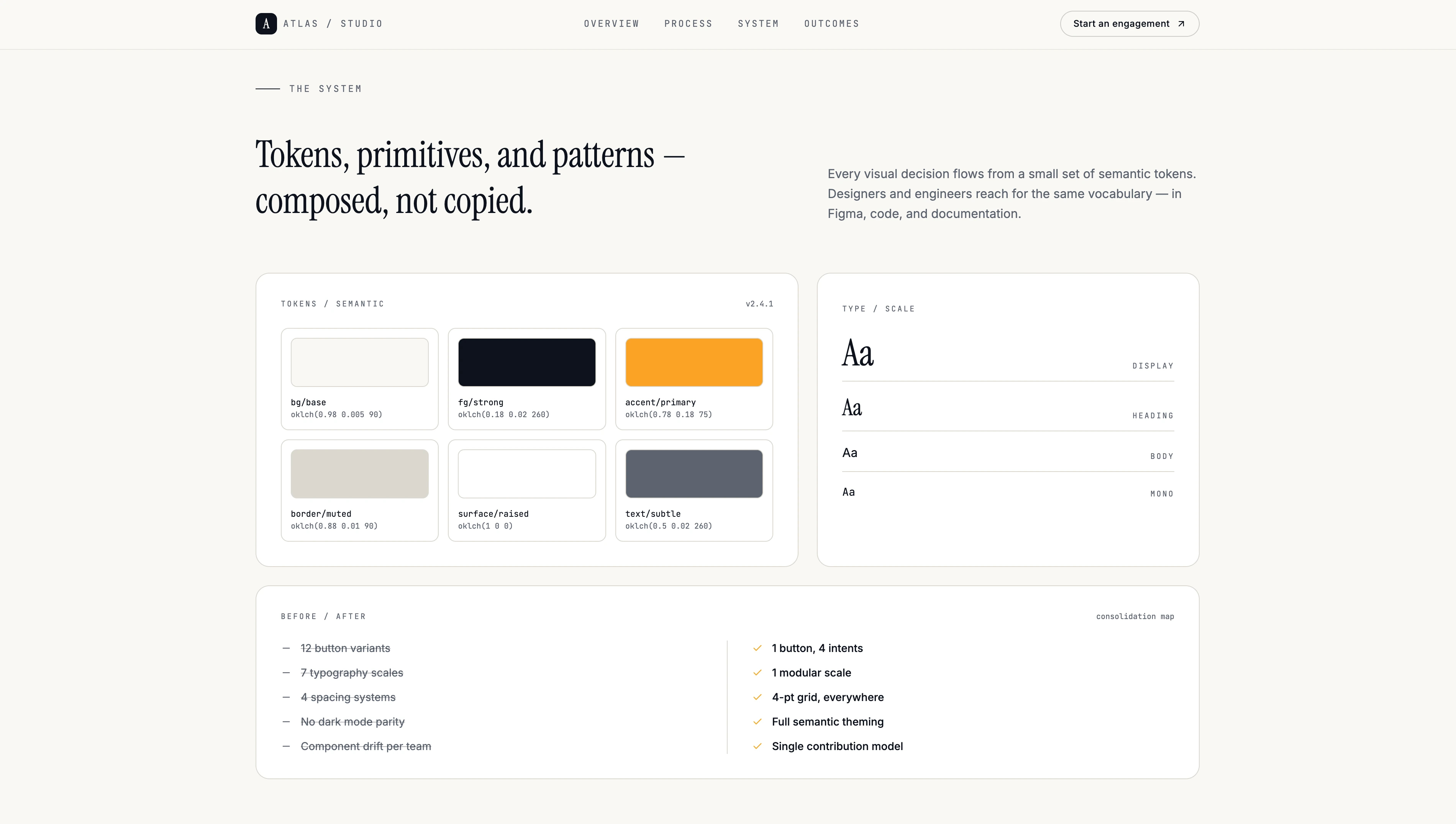
No shared source of truth
Buttons, form states, tables, and modal patterns were being implemented differently across product teams, even when serving similar jobs.
Growing CSS debt
Custom CSS had accumulated organically, making styling harder to maintain and slowing new feature development.
Slow feature rollout
Teams were repeatedly solving the same foundational UI problems instead of focusing on product-level differentiation.
The Strategic Solution
A unified design system created one source of truth across design and engineering.
Laur approached the engagement as a systems problem rather than a component clean-up exercise. The goal was to connect design tokens, reusable components, and usage guidance into one dependable framework teams could adopt immediately.
Comprehensive UI audit
Existing interface patterns were cataloged, rationalized, and consolidated so redundant variants could be removed before new standards were defined.
Token-based Figma system
Color, spacing, typography, and interaction rules were organized into a scalable token architecture that made design decisions more portable and consistent.
Accessible React component library
The design system was translated into documented, plug-and-play React components so engineering teams could adopt it with minimal friction.
High-Velocity Execution
A targeted four-week engagement aligned tokens, components, and team adoption.
The program was intentionally focused: establish the design foundation quickly, engineer the most high-leverage components first, and document the system well enough for internal adoption.
Weeks 01–02
Audit and token architecture
Review current UI patterns, define the design token model, and organize the Figma system for cross-team consistency.
Week 03
Component engineering
Build the highest-value React components and align their API design with the new token architecture.
Week 04
Documentation and rollout support
Create usage guidance, component examples, and handoff materials so internal teams can implement the system without translation gaps.
Tech Stack
The system stack linked design tokens, production components, and documentation.
The tooling was chosen to keep design and engineering aligned around one repeatable system rather than parallel, drifting sources of truth.
- Figma
- Design tokens
- React
- TypeScript
- Tailwind CSS
- Storybook
Business Outcomes (ROI)
The new system reduced delivery time and removed a major source of front-end debt.
The strongest outcomes show up over time: more consistent product delivery, cleaner code, and faster execution across teams.
-60%
Reduction in internal front-end delivery time
100%
Visual consistency across three product dashboards
-4.8k
Lines of redundant legacy CSS removed
+40%
Faster onboarding for newly hired product engineers
Why this format matters
Design systems create leverage when they reduce decision overhead for the whole team.
This representative case study shows how Laur approaches system work as an operational multiplier—connecting product consistency, front-end maintainability, and team speed into one scalable foundation.