Introduction
Have you ever built a beautiful component library only to watch it become outdated within months? Or perhaps you’ve struggled with keeping your Figma designs synchronized with the actual code implementation? In the world of modern web development, the disconnect between design and code is one of the most persistent challenges teams face. Designers create pixel-perfect mockups in Figma, developers implement them in code, and then the inevitable drift begins—designs evolve, code changes, and before long, your design system exists in two increasingly divergent forms.
In this article, we’ll explore how to create a truly living design system that bridges the gap between Figma and code using AstroJS. Rather than treating your component library as a static artifact, we’ll show you how to build a dynamic, self-updating system where changes in Figma automatically propagate to your codebase, and vice versa. By combining Figma’s powerful design capabilities with AstroJS’s flexible framework, you can create a harmonious workflow that keeps designers and developers in sync, reduces redundant work, and maintains consistency across your entire product ecosystem.
Understanding the Design-to-Development Gap
The traditional workflow between design and development is fraught with inefficiencies and communication challenges. Designers create in Figma, export static assets, write detailed specifications, and hand everything off to developers who then need to interpret and implement these designs in code. This handoff is where problems begin to multiply.
One common scenario we’ve encountered with clients is what we call “interpretation drift.” A designer creates a dropdown menu with specific padding, border radius, and transition effects. The developer implements it based on their understanding, but subtle differences creep in—perhaps the timing function of the animation is slightly off, or the shadow is a few pixels too large. These small discrepancies multiply across components until the implemented product no longer matches the designed vision.
Another significant challenge is handling updates. When a designer modifies a component in Figma—perhaps changing the primary button’s border radius from 4px to 8px—that change needs to propagate across dozens of instances in the design files and then somehow make its way into the code. Without a structured system, these updates require manual work and are prone to inconsistency.
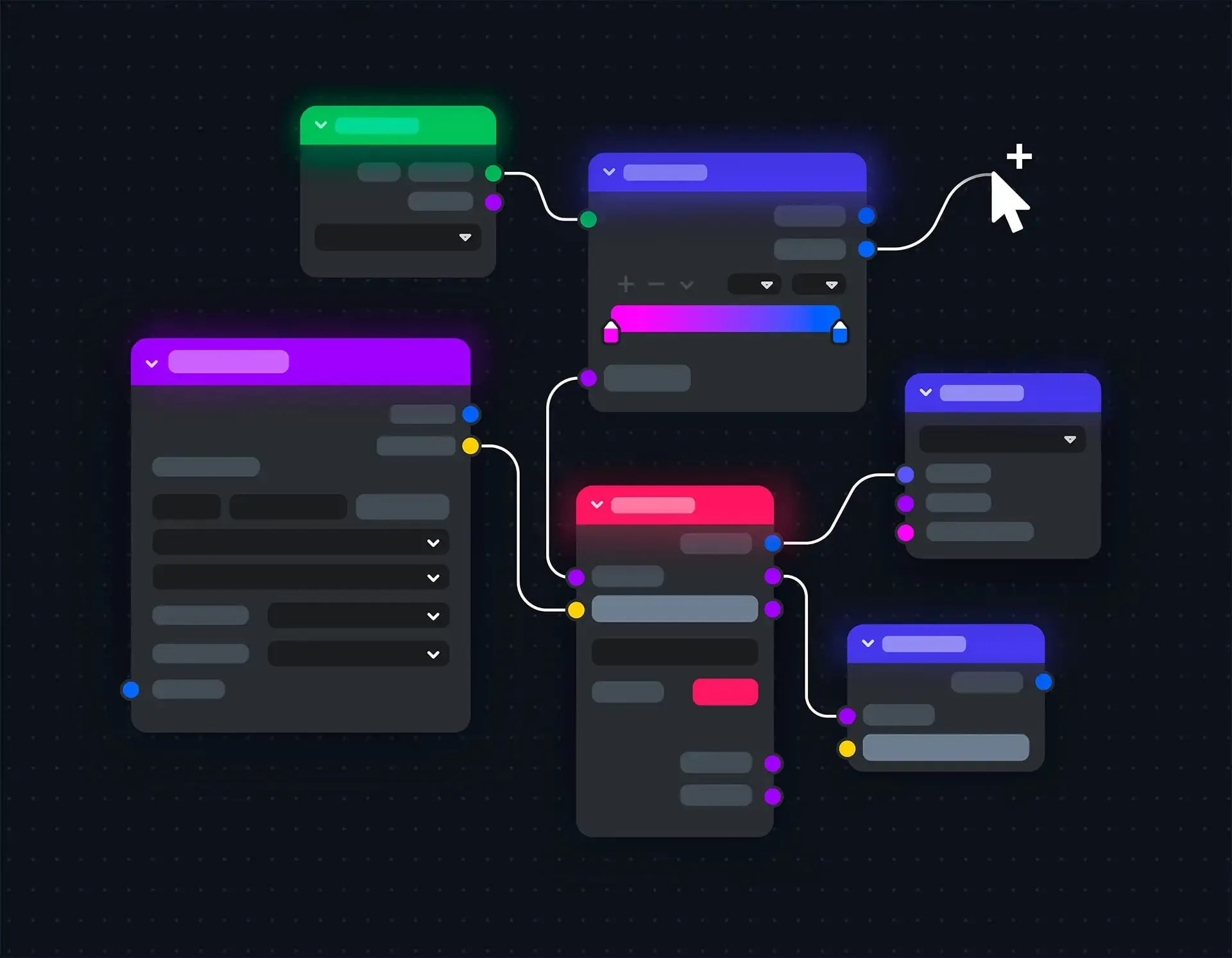
The solution to these challenges is creating a living design system—one where Figma and code are connected through a shared language of design tokens and automated synchronization.
Establishing Figma as Your Design Source of Truth
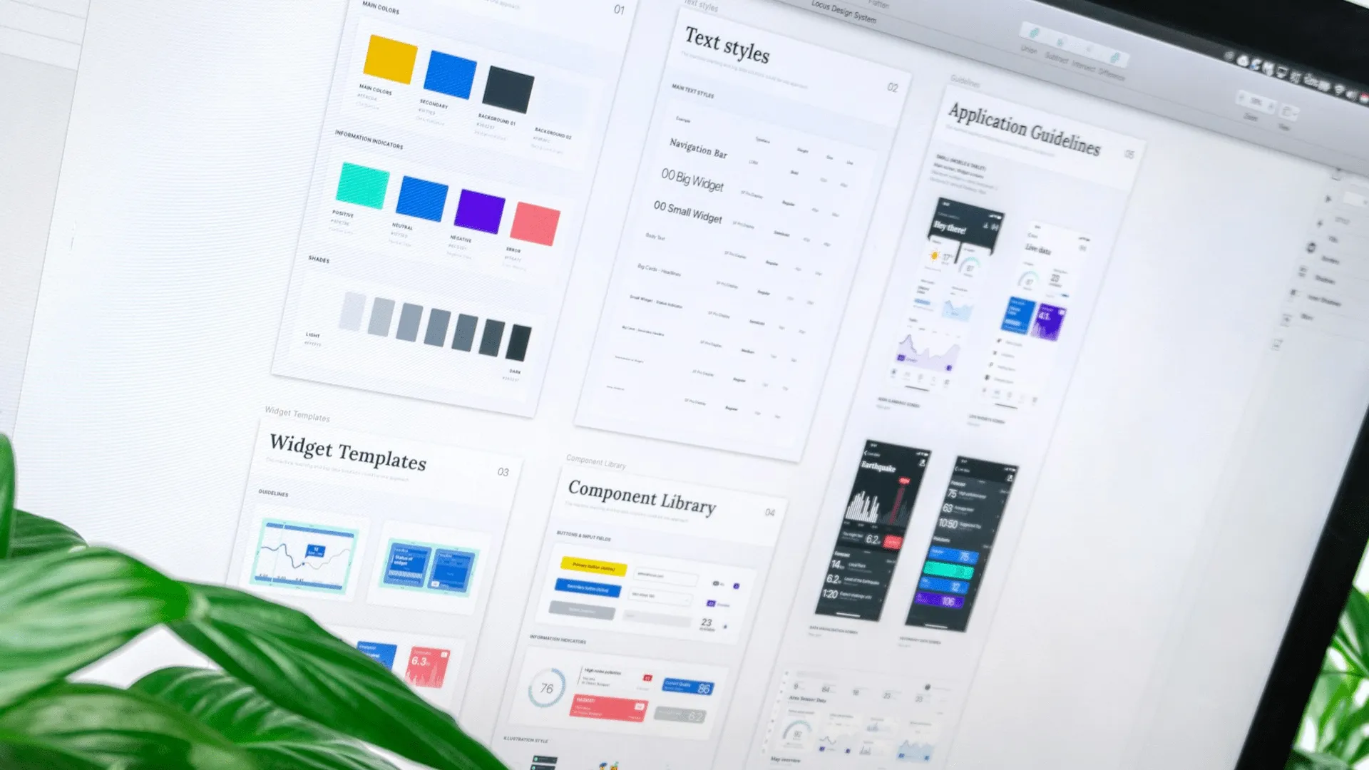
The first step in creating a living design system is setting up Figma as the single source of truth for your design assets. This requires a structured approach to organizing your Figma files and leveraging Figma’s built-in features for creating reusable components and styles.
Structuring Your Figma Library
A well-organized Figma library is fundamental to a successful design system. Here’s a structure we’ve found effective:
- Design Tokens File: Contains all color styles, text styles, effect styles, and variables
- Component Library File: Houses all reusable components organized by category
- Page Templates File: Demonstrates how components work together in context
- Documentation File: Explains usage guidelines, variants, and principles
The key to this structure is creating clear dependencies between files, with the Design Tokens file serving as the foundation.
Leveraging Figma Variables and Styles
Figma Variables (introduced in 2023) are a game-changer for design systems. They allow you to define values that can be reused across your design files and even create different modes (like light and dark themes).
Start by defining your core design tokens as variables:
- Colors (primary, secondary, accent, neutrals)
- Typography (font families, sizes, weights, line heights)
- Spacing (padding, margins, gaps)
- Border radii
- Shadow effects
- Animation timings
Then use these variables to create Styles (for colors, text, effects) and Component properties. This approach ensures that any change to a variable automatically updates all elements using that variable.
Documenting Component Variants and States
For each component in your library, document all possible variants and states. For example, a button component might have:
- Variants: primary, secondary, tertiary, ghost
- States: default, hover, active, disabled
- Sizes: small, medium, large
By thoroughly documenting these variations in Figma, you create a comprehensive reference that developers can use to ensure their code implementation covers all use cases.
Bridging Figma and Code with Design Tokens
Design tokens are the shared language that connects your Figma designs with your code implementation. They represent the smallest design decisions (colors, spacing, typography, etc.) and serve as the foundation for your entire design system.
Exporting Design Tokens from Figma
There are several approaches to exporting design tokens from Figma:
- Figma Tokens Plugin: A popular plugin that allows you to manage and export design tokens
- Figma API: For more customized solutions, you can use the Figma API to extract variables and styles
- Style Dictionary: A tool that helps you manage design tokens across platforms
Here’s an example of using the Figma API to extract color variables:
// Script to extract color variables from Figma
async function extractFigmaVariables(fileKey, token) {
  const response = await fetch(
    `https://api.figma.com/v1/files/${fileKey}/variables/local`,
    {
      headers: {
        'X-Figma-Token': token
      }
    }
  );

  const data = await response.json();
  const colorVariables = data.meta.variables.filter(
    variable => variable.resolvedType === 'COLOR'
  );

  return colorVariables.map(variable => ({
    id: variable.id,
    name: variable.name,
    value: variable.valuesByMode
  }));
}
Transforming Tokens for CSS, JavaScript, and Beyond
Once extracted, these tokens need to be transformed into formats usable in your codebase. A common approach is to generate:
- CSS custom properties
- JavaScript constants
- TypeScript types
- JSON configuration files
Here’s an example of transforming color tokens into CSS custom properties:
// Transform Figma color tokens to CSS variables
function transformToCSS(colorTokens) {
  let css = `:root {\n`;

  colorTokens.forEach(token => {
    // Get the default mode value
    const defaultModeId = Object.keys(token.valuesByMode)[0];
    const rgbColor = token.valuesByMode[defaultModeId];

    // Convert to hex or rgba
    const color = rgbToHex(rgbColor);

    // Format variable name from "Colors/Primary/500" to "--color-primary-500"
    const name = token.name
      .replace(/\//g, '-')
      .toLowerCase()
      .replace(/\s+/g, '-');

    css += `  --${name}: ${color};\n`;
  });

  css += `}\n`;
  return css;
}
Automating Token Synchronization
To create a truly living design system, token synchronization should be automated. This can be achieved through:
- CI/CD Integration: Run token extraction and transformation as part of your CI/CD pipeline
- Webhook Triggers: Use Figma webhooks to trigger updates when design tokens change
- Version Control: Store tokens in your codebase and track changes with Git
A practical implementation might include a GitHub Action that runs whenever changes are pushed to your Figma file:
# .github/workflows/update-design-tokens.yml
name: Update Design Tokens

on:
  repository_dispatch:
    types: [figma_update]
  schedule:
    - cron: '0 0 * * *'  # Daily check

jobs:
  update-tokens:
    runs-on: ubuntu-latest
    steps:
      - uses: actions/checkout@v3

      - name: Setup Node.js
        uses: actions/setup-node@v3
        with:
          node-version: '18'

      - name: Install dependencies
        run: npm ci

      - name: Extract tokens from Figma
        run: node scripts/extract-figma-tokens.js
        env:
          FIGMA_FILE_KEY: ${{ secrets.FIGMA_FILE_KEY }}
          FIGMA_TOKEN: ${{ secrets.FIGMA_TOKEN }}

      - name: Transform tokens
        run: node scripts/transform-tokens.js

      - name: Commit changes
        uses: stefanzweifel/git-auto-commit-action@v4
        with:
          commit_message: "Update design tokens from Figma"
          file_pattern: "src/styles/tokens/*"
Building a Component Documentation Site with AstroJS
AstroJS is uniquely suited for building design system documentation due to its island architecture, static site generation capabilities, and content collections feature. Let’s explore how to leverage these strengths to create a comprehensive component catalog.
Setting Up the AstroJS Project Structure
Start by creating a dedicated AstroJS project for your design system:
# Create a new Astro project
npm create astro@latest design-system-docs
cd design-system-docs

# Install necessary dependencies
npm install @astrojs/mdx @astrojs/react
Then structure your project to support both documentation and interactive examples:
design-system/
├── src/
│   ├── components/     # Your actual components
│   ├── tokens/         # Design tokens
│   ├── docs/           # Component documentation
│   ├── examples/       # Interactive examples
│   ├── layouts/        # Documentation layouts
│   └── pages/          # Astro pages
├── public/
│   └── assets/         # Images and other static files
└── astro.config.mjs    # Astro configuration
Creating Interactive Component Examples
One of the strengths of using AstroJS for a design system is the ability to create interactive examples. You can use island architecture to render React, Vue, or Svelte components within otherwise static pages:
---
// src/pages/components/button.astro
import ComponentLayout from '../../layouts/ComponentLayout.astro';
import { Button } from '../../components/Button';
---

<ComponentLayout title="Button Component">
  <h1>Button Component</h1>

  <section class="examples">
    <h2>Variants</h2>
    <div class="example-grid">
      <div class="example">
        <Button variant="primary">Primary Button</Button>
        <code>{'<Button variant="primary">Primary Button</Button>'}</code>
      </div>

      <div class="example">
        <Button variant="secondary">Secondary Button</Button>
        <code>{'<Button variant="secondary">Secondary Button</Button>'}</code>
      </div>

      <div class="example">
        <Button variant="tertiary">Tertiary Button</Button>
        <code>{'<Button variant="tertiary">Tertiary Button</Button>'}</code>
      </div>
    </div>

    <h2>States</h2>
    <div class="example-grid">
      <div class="example">
        <Button disabled>Disabled Button</Button>
        <code>{'<Button disabled>Disabled Button</Button>'}</code>
      </div>

      <div class="example">
        <Button loading>Loading Button</Button>
        <code>{'<Button loading>Loading Button</Button>'}</code>
      </div>
    </div>
  </section>

  <section class="documentation">
    <h2>Usage Guidelines</h2>
    <p>Use primary buttons for main actions, secondary buttons for alternative actions, and tertiary buttons for less important actions.</p>

    <h2>Properties</h2>
    <table>
      <thead>
        <tr>
          <th>Property</th>
          <th>Type</th>
          <th>Default</th>
          <th>Description</th>
        </tr>
      </thead>
      <tbody>
        <tr>
          <td>variant</td>
          <td>string</td>
          <td>'primary'</td>
          <td>Button style variant: 'primary', 'secondary', or 'tertiary'</td>
        </tr>
        <tr>
          <td>size</td>
          <td>string</td>
          <td>'medium'</td>
          <td>Button size: 'small', 'medium', or 'large'</td>
        </tr>
        <tr>
          <td>disabled</td>
          <td>boolean</td>
          <td>false</td>
          <td>Whether the button is disabled</td>
        </tr>
        <tr>
          <td>loading</td>
          <td>boolean</td>
          <td>false</td>
          <td>Whether to show a loading indicator</td>
        </tr>
      </tbody>
    </table>
  </section>
</ComponentLayout>
Implementing Design Token Visualization
Your design system documentation should include visual representations of your design tokens:
---
// src/pages/tokens/colors.astro
import TokenLayout from '../../layouts/TokenLayout.astro';
import * as colorTokens from '../../tokens/colors';
---

<TokenLayout title="Color Tokens">
  <h1>Color Tokens</h1>

  <section class="token-category">
    <h2>Primary Colors</h2>
    <div class="token-grid">
      {Object.entries(colorTokens.primary).map(([name, value]) => (
        <div class="token-item">
          <div class="color-swatch" style={`background-color: ${value};`}></div>
          <div class="token-details">
            <code>--color-primary-{name}</code>
            <span class="token-value">{value}</span>
          </div>
        </div>
      ))}
    </div>
  </section>

  <section class="token-category">
    <h2>Neutral Colors</h2>
    <div class="token-grid">
      {Object.entries(colorTokens.neutrals).map(([name, value]) => (
        <div class="token-item">
          <div class="color-swatch" style={`background-color: ${value};`}></div>
          <div class="token-details">
            <code>--color-neutral-{name}</code>
            <span class="token-value">{value}</span>
          </div>
        </div>
      ))}
    </div>
  </section>
</TokenLayout>
Creating Documentation with MDX
AstroJS’s MDX integration allows you to write rich documentation with embedded components:
---
title: "Button Component"
description: "A versatile button component with multiple variants and states"
---
import { Button } from '../../components/Button';
import ComponentDemo from '../../components/ComponentDemo.astro';

# Button Component

Buttons allow users to take actions and make choices with a single tap.

## Usage

Buttons communicate actions that users can take. They are typically placed in dialogs, forms, cards, and toolbars.

<ComponentDemo>
  <Button variant="primary">Primary Action</Button>
  <Button variant="secondary">Secondary Action</Button>
</ComponentDemo>

## Best Practices

- Use primary buttons for the main action in a section
- Limit the number of primary buttons on a page
- Use clear and action-oriented button text
- Keep button text concise

## Accessibility

- Buttons are focusable with keyboard navigation
- Include aria-label for buttons without text
- Maintain a minimum touch target size of 44×44 pixels
Ensuring Design-Development Consistency with AstroJS
The final piece of creating a living design system is establishing processes and tools that ensure ongoing consistency between your Figma designs and code implementation.
Component-Driven Testing with Storybook and AstroJS
Integrate Storybook with your AstroJS project to enable component-driven testing:
// .storybook/main.js
module.exports = {
  stories: ['../src/**/*.stories.@(js|jsx|ts|tsx|mdx)'],
  addons: [
    '@storybook/addon-links',
    '@storybook/addon-essentials',
    '@storybook/addon-a11y',
  ],
  framework: {
    name: '@storybook/react-vite',
    options: {}
  },
  docs: {
    autodocs: true
  }
};
Then create stories for each component:
// src/components/Button.stories.js
import { Button } from './Button';

export default {
  title: 'Components/Button',
  component: Button,
  argTypes: {
    variant: {
      control: { type: 'select', options: ['primary', 'secondary', 'tertiary'] },
    },
    size: {
      control: { type: 'select', options: ['small', 'medium', 'large'] },
    },
    disabled: { control: 'boolean' },
    loading: { control: 'boolean' },
  },
};

const Template = (args) => <Button {...args}>Button Text</Button>;

export const Primary = Template.bind({});
Primary.args = {
  variant: 'primary',
  size: 'medium',
};

export const Secondary = Template.bind({});
Secondary.args = {
  variant: 'secondary',
  size: 'medium',
};

export const Small = Template.bind({});
Small.args = {
  variant: 'primary',
  size: 'small',
};

export const Disabled = Template.bind({});
Disabled.args = {
  variant: 'primary',
  disabled: true,
};
Visual Regression Testing
Implement visual regression testing to catch unintended changes:
// src/components/Button.test.js
import { test, expect } from '@playwright/test';

test('Button component visual regression', async ({ page }) => {
  await page.goto('http://localhost:6006/iframe.html?args=&id=components-button--primary');

  // Take a screenshot and compare with baseline
  expect(await page.screenshot()).toMatchSnapshot('button-primary.png');

  // Test hover state
  await page.hover('button');
  expect(await page.screenshot()).toMatchSnapshot('button-primary-hover.png');

  // Test disabled state
  await page.goto('http://localhost:6006/iframe.html?args=&id=components-button--disabled');
  expect(await page.screenshot()).toMatchSnapshot('button-disabled.png');
});
Continuous Integration for Design Systems
Set up a CI pipeline that:
- Extracts and transforms design tokens from Figma
- Updates your AstroJS components accordingly
- Runs visual regression tests
- Deploys the updated design system documentation
This ensures that your design system remains a living, breathing entity that evolves with your product.
Try It Yourself: Creating a Simple Design System
Ready to create your own living design system? Here’s a step-by-step guide to get started:
-
Set up your Figma library:
- Create a file for design tokens (colors, typography, spacing)
- Define variables for all design decisions
- Create basic components using these variables
-
Export design tokens:
- Install the Figma Tokens plugin
- Configure token groups for colors, typography, etc.
- Export tokens as JSON
-
Set up your AstroJS project:
npm create astro@latest my-design-system cd my-design-system npm install @astrojs/mdx @astrojs/react -
Import and transform design tokens:
mkdir -p src/tokens # Copy your exported tokens to src/tokens/figma-tokens.json # Create a script to transform tokens touch scripts/transform-tokens.js -
Create basic components:
- Start with simple components like buttons, inputs, and cards
- Use design tokens for all styling decisions
- Document component variations and states
-
Build your documentation site:
- Create pages for design principles, token reference, and components
- Add interactive examples
- Include usage guidelines and accessibility information
-
Set up automation:
- Create a script to fetch tokens from Figma API
- Implement a GitHub Action to run on schedule
- Add visual regression testing
Conclusion
Creating a living design system with Figma and AstroJS bridges the gap between design and development, ensuring consistency across your digital products. By establishing Figma as your design source of truth, using design tokens as a shared language, and building a comprehensive component documentation site with AstroJS, you create a sustainable system that evolves with your product.
The benefits of this approach are numerous: designers and developers work from the same foundation, updates propagate automatically through your system, and your product maintains visual consistency even as it grows and changes. The initial investment in setting up these processes pays dividends in reduced friction, faster development cycles, and a better user experience.
As you continue to develop your design system, remember that it’s not just a technical artifact but a living product that requires ongoing maintenance and care. By treating it as such, you’ll create a valuable asset that serves your team and users for years to come.